
There's a funny thing around Software, and i think especially about OpenSourceSoftware:
Everyone around want's to see some Screenshots before using it.
Readmes? Manpages??? - Who cares about that stuff?
"We want a Screenshot!!!"
"You'll see it right after installing anyway..."
"We want a screenshot!!!!"
"Well, errm... don't you think, this becomes somewhat boring, monotone...? Right...?"
"SCREEEEENSHOOOTS!!!"
...
..... :)
....... =)
Well, i guess this is a fast world and a picture can say more than even a million words.
(Proof? What do you think, how many blind guys read the Playboy?)
In fact they do make sense for a style. (But i had a guy who insisted on a shot of a shell app...;)
So as i assume you clicked this page first, i'll use this section for some kind of shameless self promotion (but it's marked in the title, so you can't sue me)

The Desktop of the common man:
Work, system control and err.. well, i fear most people wouldn't call Mozart's Requiem "entertainment" so let's say "edutainment"!
Before you ask:
To get translucent windows and nice shadows, you'll need X.org > 6.8 and activate the Composite extension. (+ xcompmgr to use it and a kwin patch to autoswitch stuff - ask google.com)
But if you take a close look, you'll notice that kwrite looks somewhat different from juk - more on that later.

Since the late nineties, the allmighty Computer turned into an allmost Single Task Machine for a lot of users, and i guess if you don't use Firefox, you'll run Konqueror a lot.
So you should really know what it will look like using Baghira.

...Safari.
Apple took the khtml engine, wrote their own Browser and called it "Safari" (probably because "Settler" would not have made a good name, or because they like the Beach Boys, or just because the internet reminds them to a savannah - boring and empty most of the time, but has some really great moments... who cares)
Well, while with Window$, surfing the internet would be really close to entering the wild, Linux does not need such things and as we tend to be purists (ok, "were...") - there is no Safari on KDE.
...
But you could make Konqueror to look like it! :]
Notice, that the popups changed as well, but you can still control that....
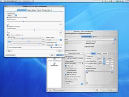
... what brings us to "options".
Though most people when (if) reading the GPL think of the freedom of beer - what is in fact a nice thing, allthough my barkeeper doesn't really like it - there's more freedom in it.
The meant (and stated) freedom is the freedom of choice and speech.
You should be able to modify the sources to align your wishes.
Unfortunately to have to be able to code to do so - and willing to read into several thousand lines of code...
To make things a bit easier, there's really a big bunch of options - check the Help page for more info, you can allmost change anything.
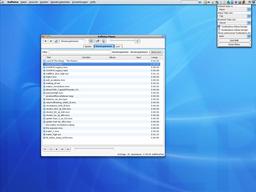
Well, options are nice, but without the ease of use, they're as useless as cancer.
So look at this shot.
What you see is the Playlist Window of Kaffeine (KDE Xine Frontend, never tried?) - showing a lot of trailers - better luck next time, MPIAA ;)
What you can see as well, is the config dialog of a systray app that will help you to control this beast.
BAB (don't ask for the meaning) resists in your systray (if you start it...) and lets you swap the look of upcoming apps by a single mouseclick.
It's also accessable via DCOP, what allows you to use scripts to control the look of apps, e.g. i have a safari script, that lets konqueror startup with the brushed metal look and an itunes script that does the same for juk.
Don't worry - the scripts are rather simple (just calling a one/two line command) and there's a explanation on the help page as well as some samples in the SpinOff section.
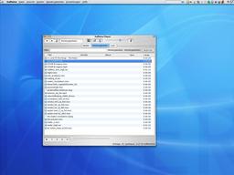
One mousclick later.
As you can see, Kaffeine looks somewhat different.
The reason (indication) is, that the paw icon in the tray changed it's color.
Don't get me wrong: you won't influence the look of running applications, but just of the new ones - bit like swapping a gate.
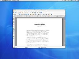
Ximian OpenOffice.org supports native skins - backport from OOo 2.0.
After some issues in the 0.5 series (i didn't even know about Ximian OOo that time) Baghira now fully supports OOo - including a non button colored menu bar / popup windows and (as they're static on OOo) alltime active scrollbars.
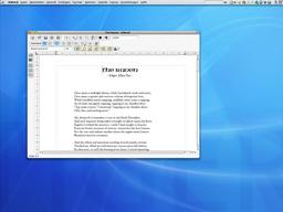
The same text in KWord.
As i don't know what else to write, i suggest to read Poe's Raven if you never did - and do not dare to read a translation - they all can't stand.
Oh, but of course, being home we have the advance of...

...Choosing the look =)