Plasma (aka Kicker) / ALI
What it is
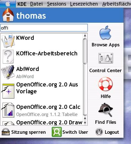 This is an approach for a KMenu replacement.
It is search oriented and puts more focus on the keyboard than the currecnt solution that forces the user to navigate through various popups, what needs a lot of coordination.
It's currently only available from baghira cvs (you do not need to checkout a complete baghira copy, the top src folder as well as the "starter" folder plus the admin folder from KDE should be enough).
It provides a menubutton replacement applet (you may know kbfx, which bases upon an early version of my code - so the functionality is similar) and of course the new "menu", or as Aaron calls his idea of Plasmas (KDE 4 Kicker) Application launch interface (ALI).
Comments and discussion is welcomed, but notice that all communication should take place on www.kde-artists.org
How it works
Items are shown if they match the given search term.
The search is applied on the item name, category and keywords, so the more smart application developers tag their apps, the better they will be found.
The idea is that the user doesn't know anything about e.g. OOo Impress, but wants to create some slides, so he types "slides" and ends up with Impress, KPreseter and whatever else there is on the system. More detailed comments due to the available space will then tell him, which he want's to use most.
Passing keaywords like "powerpoint" or "pages" (search is case insensitive) will help users that switched from other systems to find apps they need, or just because if someone asks you to create some slides, he'll tell you to use "Powerpoint", because everyone assumes you're using Window$ and have a "legal" Office copy....
Experienced users will maybe favour the executor in the search line, but still rely on the filtered itemlist.
Restrictions
Please keep in mind that this is very early staged.
Not all action buttons are working (i.e. "switch user") the GUI design is rather a prototype and the genral bahaviour may be imperfect. (Though not bad at all)
Also not all desired features are implemented (and partially probably won't be outside kicker/plasma development)
How to use
(Please do not worry about the displayed items or the GUI appereance: this is a prototype and mainly dirven by what desktop files i just knew would work ;)
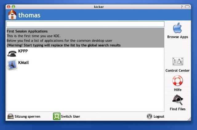
When starting for the first time (or rather during the whole first session), you'll get a list of usefull items - simply telling the common man what he probably want's to use on his brand new desktop. It's also a good way to promote new Applications with a new major release.
Above the list an info labe appears - to whatever we might wanna tell the newbies
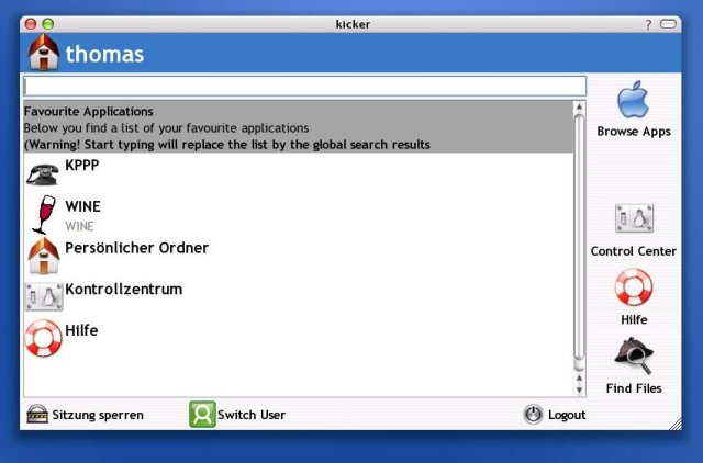
Later on the "experienced" user will get a list of his favourite applications
(The applications in the list are rank sorted - currently by last usage vs. general usage amount and we simply display the first X of them)
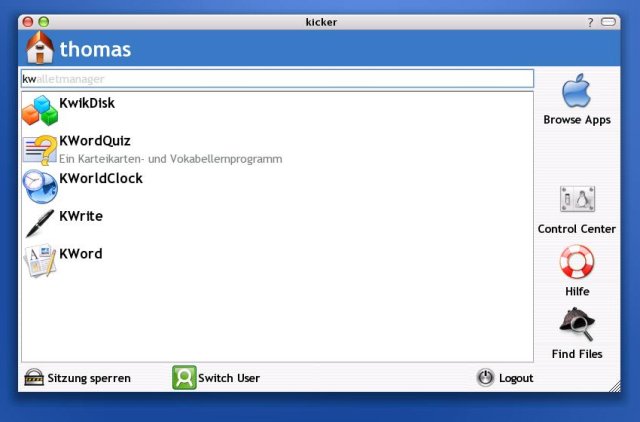
After starting to type, the info and the current list are removed and replaced by the results of a search over the typed chars
Also notice the autocompletition in the searchline that runs over the files in your $PATH environment. Hitting enter in the searchline will start the (autocompleted) command.
Search operates on the apps:
Therefore it's important to have usefull entries in these tags
Different from a popup menu we have now lots of space for comments to help the user taking his choice
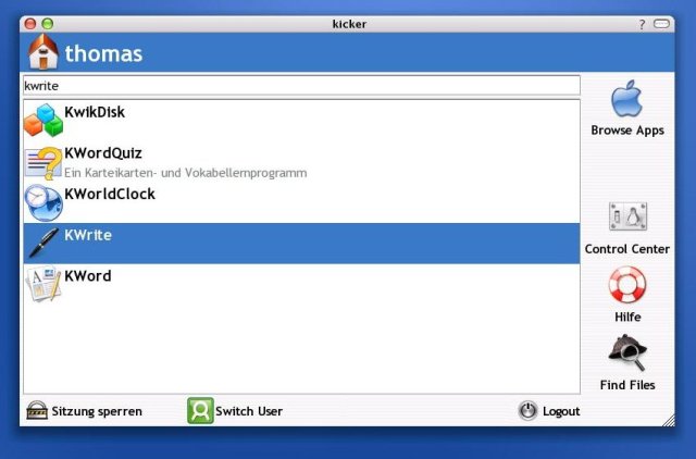
Pressing the down key will put keybord focus on the filtered application list.
Here you can navigate "up" and "down" while pressing "left" or "home" will jump the focus back to the (than selected) searchline
Hitting "enter" will start the selected entry (press "ctrl" to prevent the menu from closing after execution) but of course you can just click an entry to start it.
Though this reads complex, i think the behaviour is pretty intuitive (though certainly improvable - suggestions welcomed).
Plans for the future
Instead of showing a favourite list the item area could be used to promote an "app of the day", use KNewStuff or whatever...
Next, afaik the Design reminds far too much to WinXP (it came up when i clicked a first dummy in Qt Designer) - this is quest for the artists among you, but keep in mind that usability is more important than sexyness.
THIS MEANS: PAINT SOME GUI REDESIGN MOCKUPS!!!
Then - with incorporation into kicker - there shall be easy access to add/remove/change items. One could also think of search refinement (e.g. comma separated) and ....
Developer infos:
Usefull Keywords
making your application findable depends on how good the keys are you're tagging it with
Let's e.g. think of KWord:
KWord is an application to write, but that are KWrite, KDevelop or even KHexedit as well so write ... what?
It's an application to write formatted text WYSIWYG - but no user will ever think of this (besides this, typing WYSIWYG is quite hard - trust me ;)
So think task oriented - "what do i wanna do using this application" - the user wants to write a "letter" or a "book" or an "essay" or (maybe) an "article" so KWord should contain the keyword "write" but the task oriented keywods are far more important
(later on search strings like "i want to write a letter" should result in "KWord", "OOo Writer", etc.)
Also think of what is the de facto standard for your application (in the Mickeysoft world, yes, i know..)
While this is not an issue for KWord (as searchin "word" will find KWord as well) kspread should think of tagging the keyword "excel" and (obvious though not KDE examples) xmms should tag "winamp" and PyTunes "iTunes"
Think international!
Say you wanna tag KWrite and think Hey, "kwrite" allready contains "write", so i don't have to name this as keyword, right? - WRONG!
E.g. German users will look for "schreiben" rather than "write", and the i18n team won't translate "KWrite" to "KSchreiben" (what'd sound pretty stupid, btw), so the above example for "KWord", does not hold.
Comments
One of the worst things about popup menus is the limited space
This wouldn't be such a problem if the application functionality could be described easily in a short name (like KDevelop) or in a good icon (but not on 16x16 size!)
However, we've got plenty of space here and should use it.
Writing a novel about your Application (In summer 2005 google came up with "Summer of code, i wanted to earn some money, blahblahblah...) This is neither very interesting, nor very helpfull (personal note: imho Googles "summer of code" sucks! If you're wrinting free stuff to get $500 just for starting a project, you're certainly doing it for the wrong reasons - well, we'll see how successfull/annoying this can be...)
Ok, back to our comments: you may use rich text (you don't have to add the <qt></qt> tags, the starter doesit for you) but setting everything to bold may be a bad idea.
Your comment should contain a short and pregnant description (say about 3 lines) of what your app is good for (you can add e.g. "winamp clone", but don't assume everyone knows about winamp... ok, this may be a special case ;)
And the menus?
As mentioned above, menu space is limited, so it cannot (usefully) display a 3 line comment.
KMenu currently breaks comments to about 96 chars, but a (imho) better way is to separate between the generic name and the comment tag, where the generic name can contain a short description (KCalc -> "Calculator") and the comments can be used for some more detailed info (KCalc -> "A virtual representation of a common Desktop Calculator
Supports scientific calculation and different Number bases")


 This is an approach for a KMenu replacement.